Today we are taking a look at an example of commercial mural design. We will primarily be looking at the inspiration for the design and the impact of the mural itself.
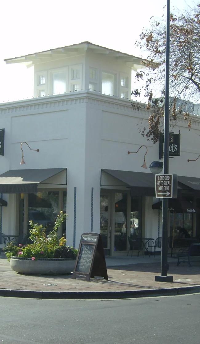
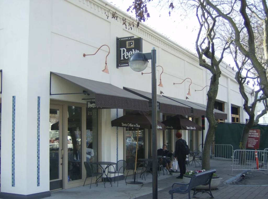
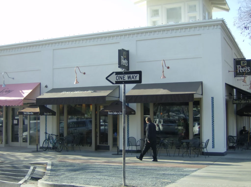
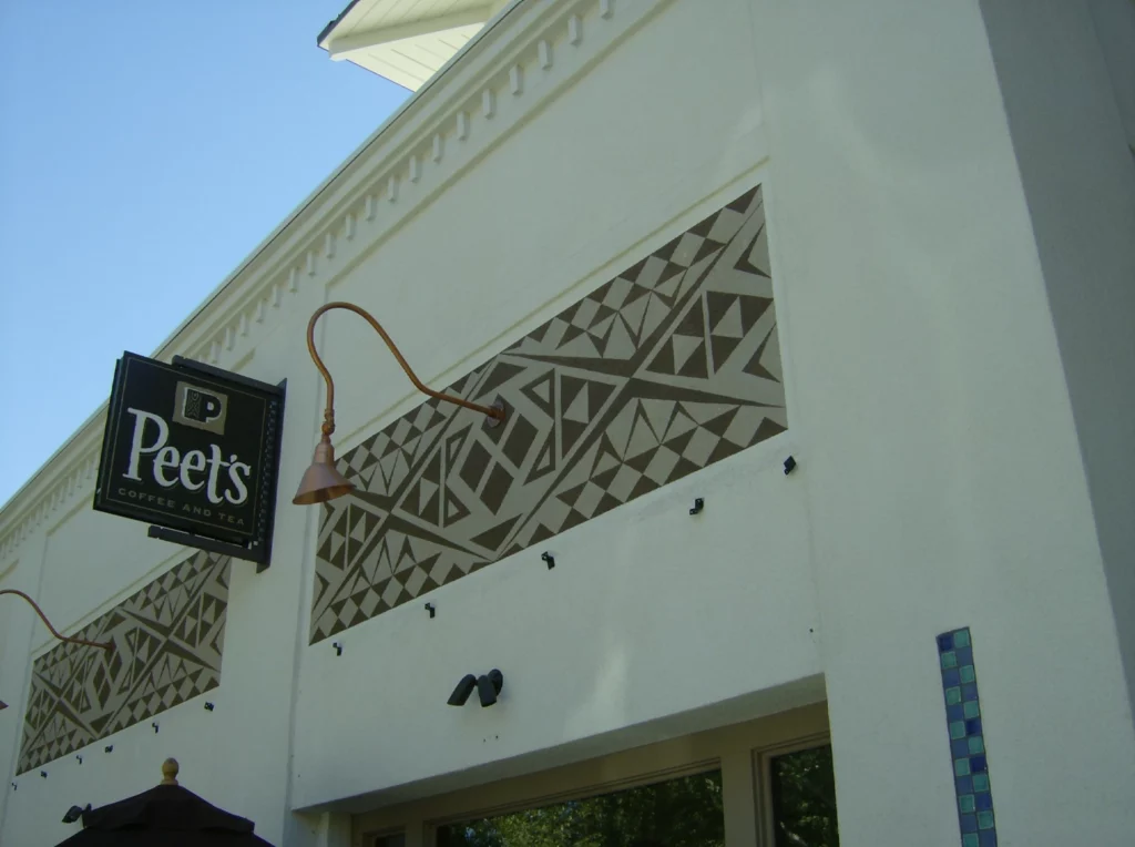
Here we get a good look at the blank walls of the coffee shop. As we can see, the building doesn’t have much going for it aesthetically. The bare white concrete, while functional, doesn’t do much to catch the eye of potential customers. Each segment of the building had a recessed pannel nitch with a gooseneck light sticking out. These nitches would serve as the “canvas” for the unique mural.
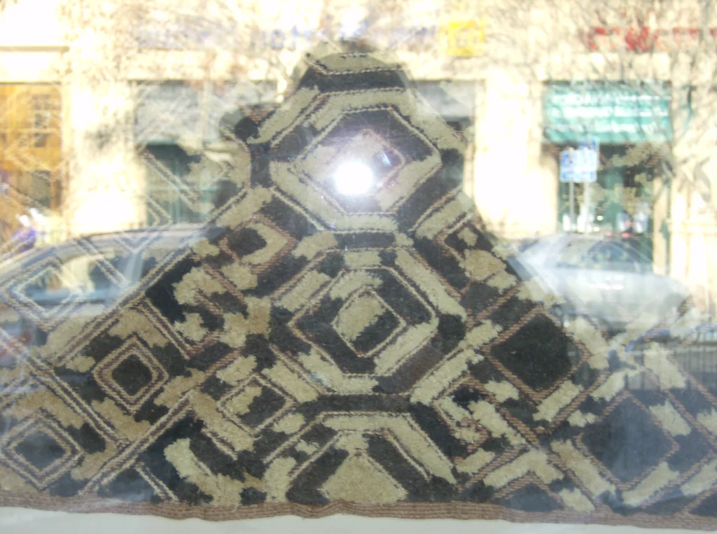
One of the most important pieces in designing a mural is an inspiration. The tenant of the building already had a particular design idea in mind. The design was inspired by a sample print that came from a Coffee region in Africa. This design was able to be implemented with the parameters of corporate. They wanted the mural to have a similar pattern to the Peet’s Coffee logo pictured above. Since Peet’s Coffee’s come from all over the world, the design challenge was to create a pattern that married both elements.
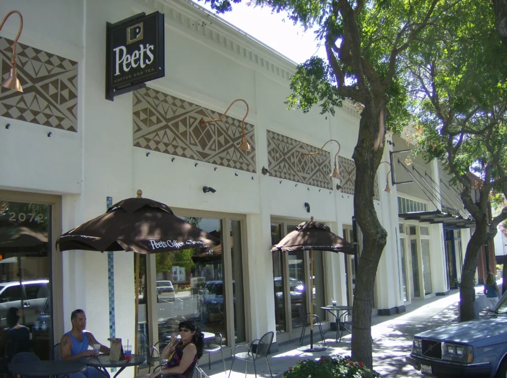
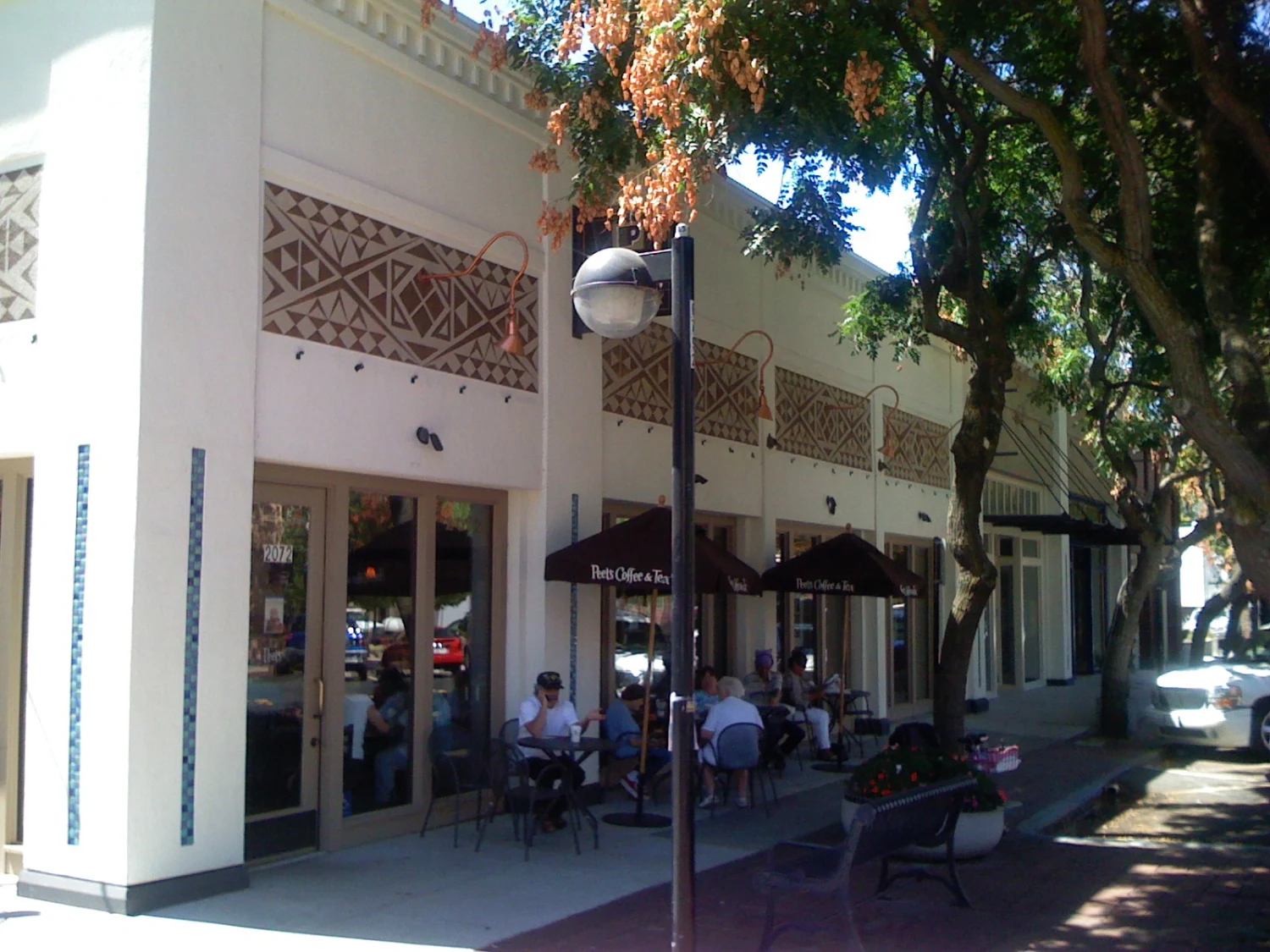
With the two design concepts put into action, a plain and simple shopfront could be transformed. The colors used were a light brown and a darker brown, specifically chosen to match Peet’s Coffee Corporate colors. The finished project created a pleasing exterior that represented coffee from all over the world. The geometric design also provided another layer of rustic character to the exterior while remaining classy.
Our interior designers are well versed in the traditional yet modern styles and will not disappoint you. Our priority is keeping an eye on your ideas and incorporating them into the types.